Year
2022
Client
LABASE
Category
Branding
Product Duration
6 - 8 Weeks
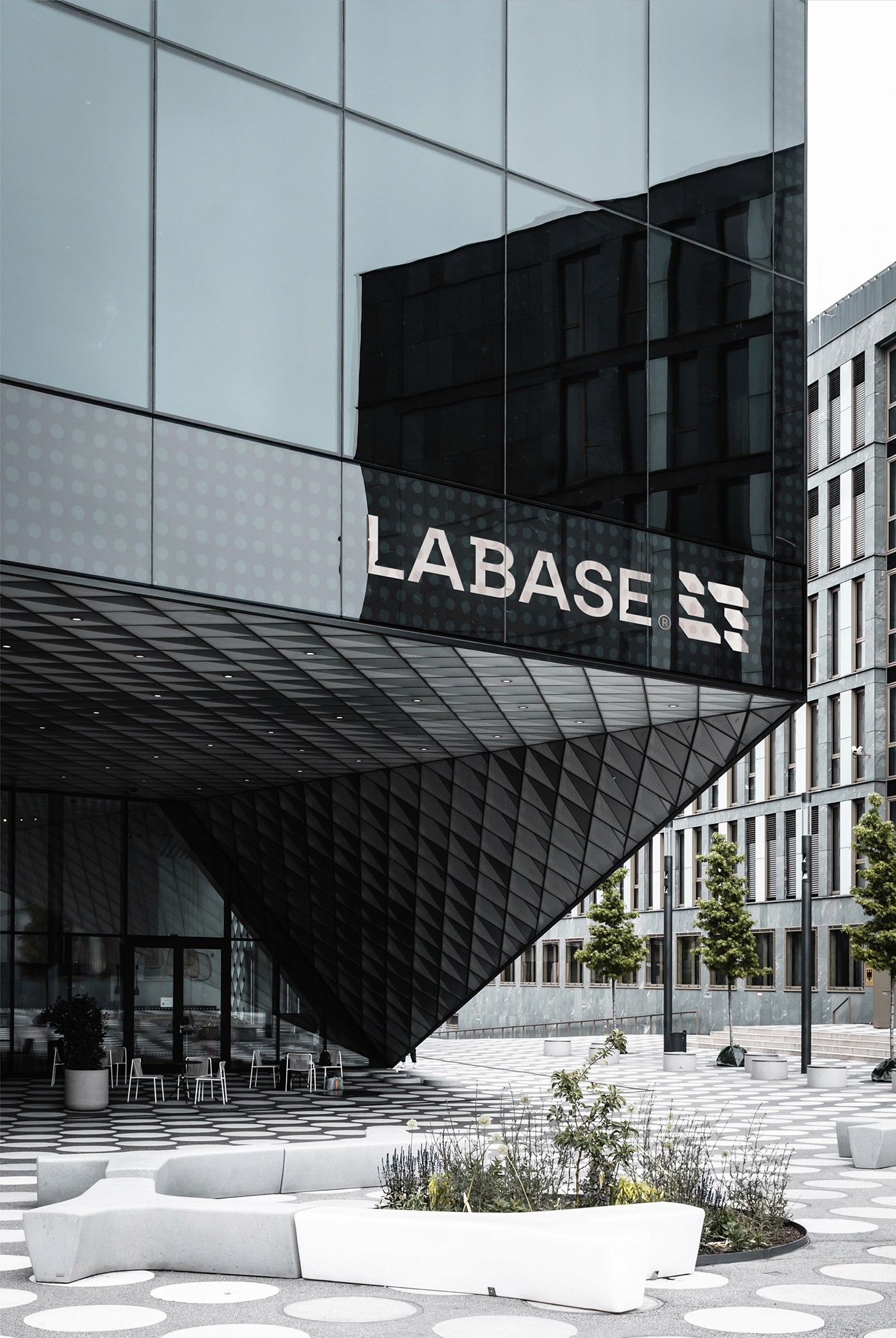
LaBase is a construction company with a focus on delivering high-quality, modern, and sustainable building solutions. As the company expanded its services and scaled its vision, it needed a refreshed brand identity that could express both professionalism and a forward-thinking mindset. The core challenge was to strike a balance between the technical nature of the construction industry and a modern visual language that inspires trust, innovation, and growth.
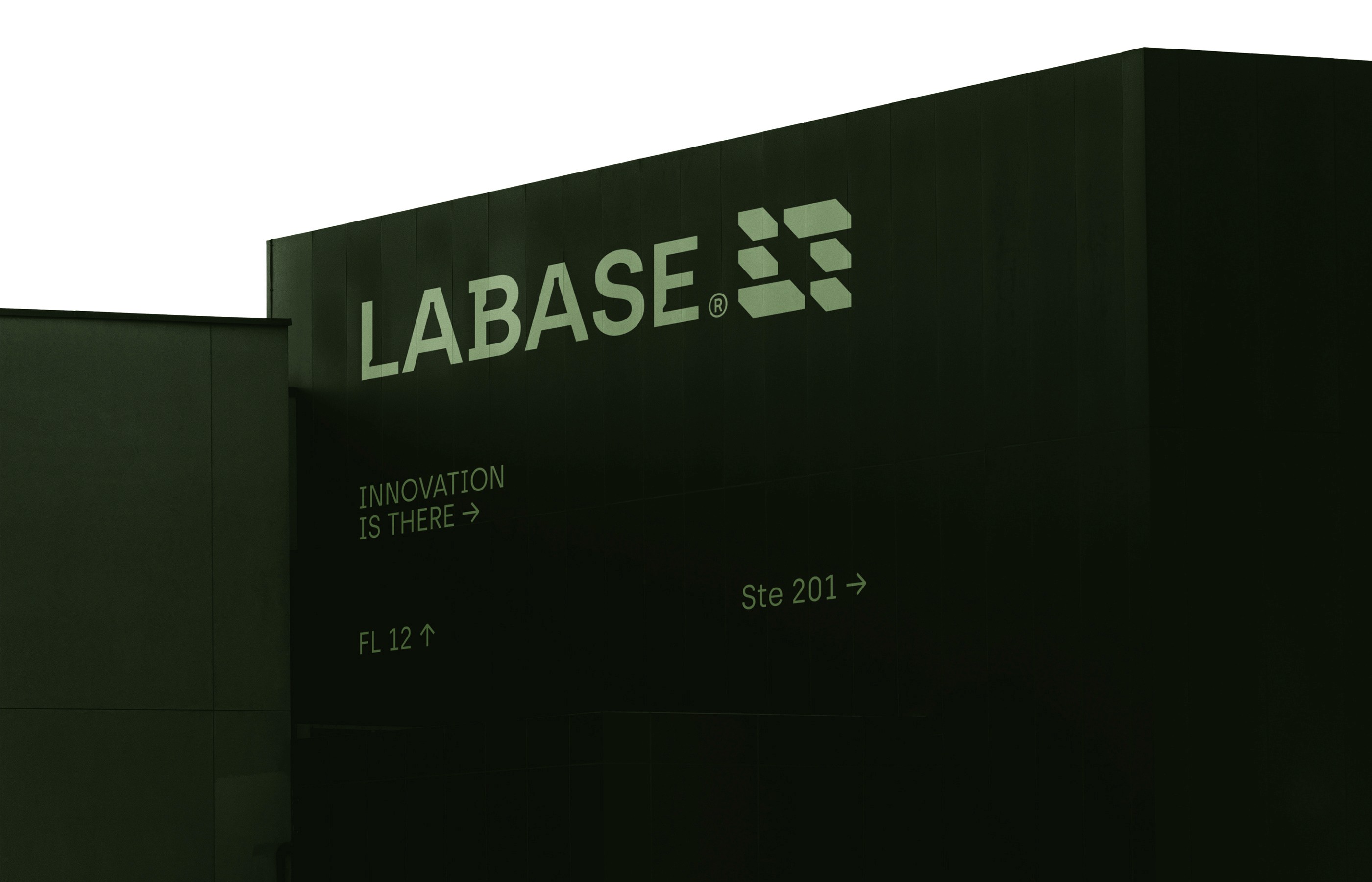
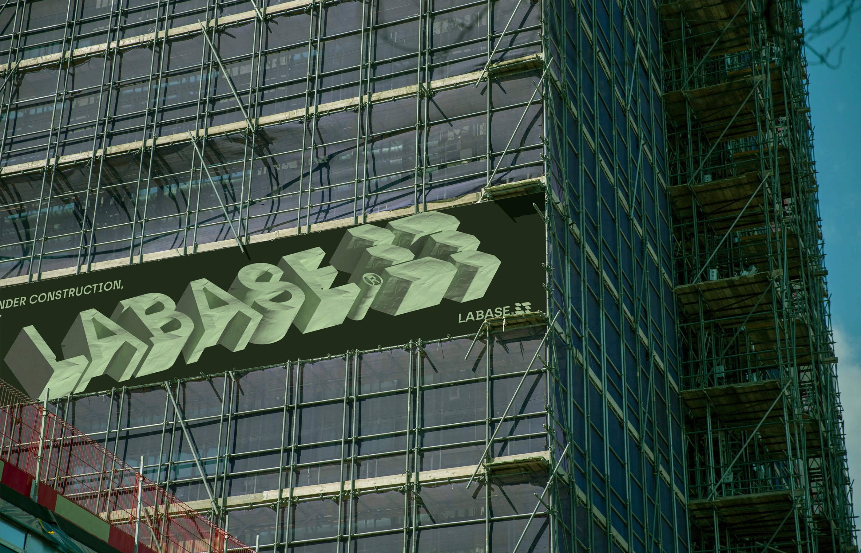
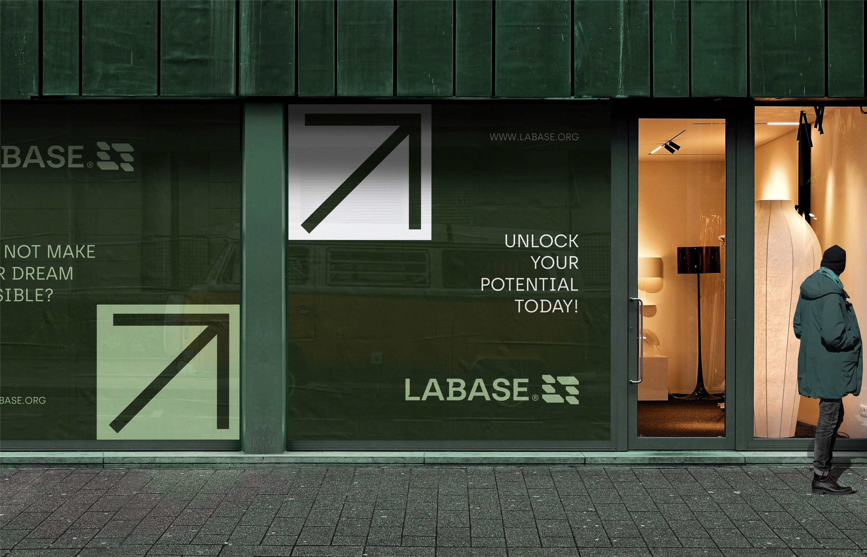
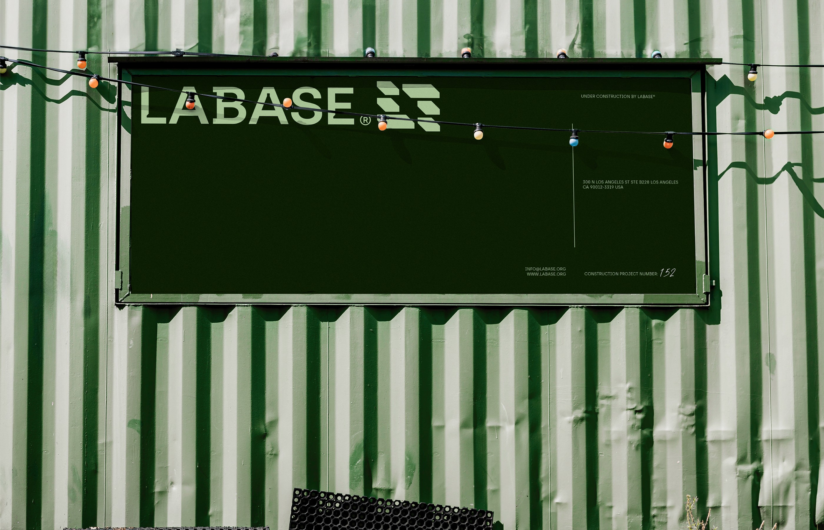
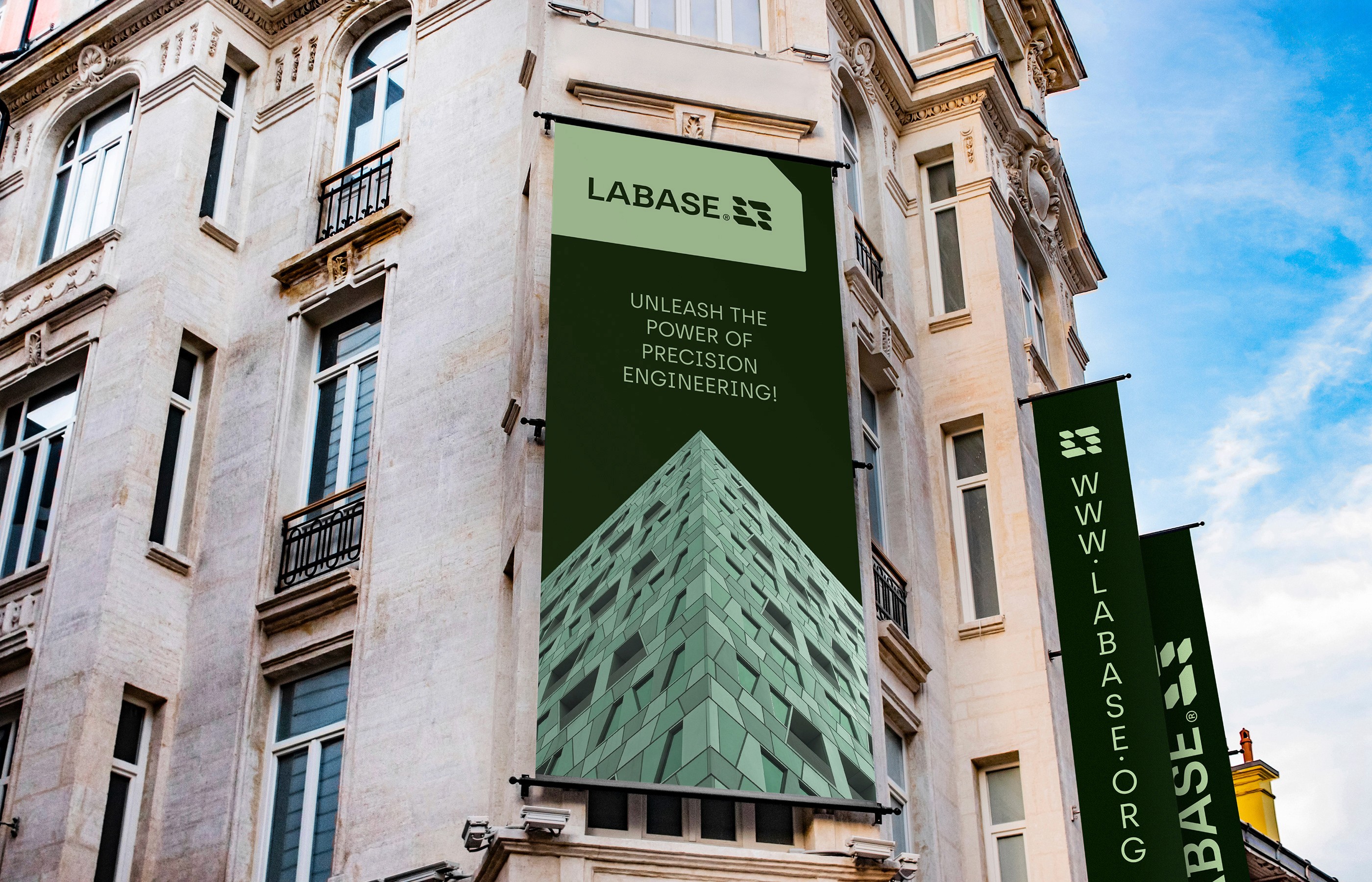
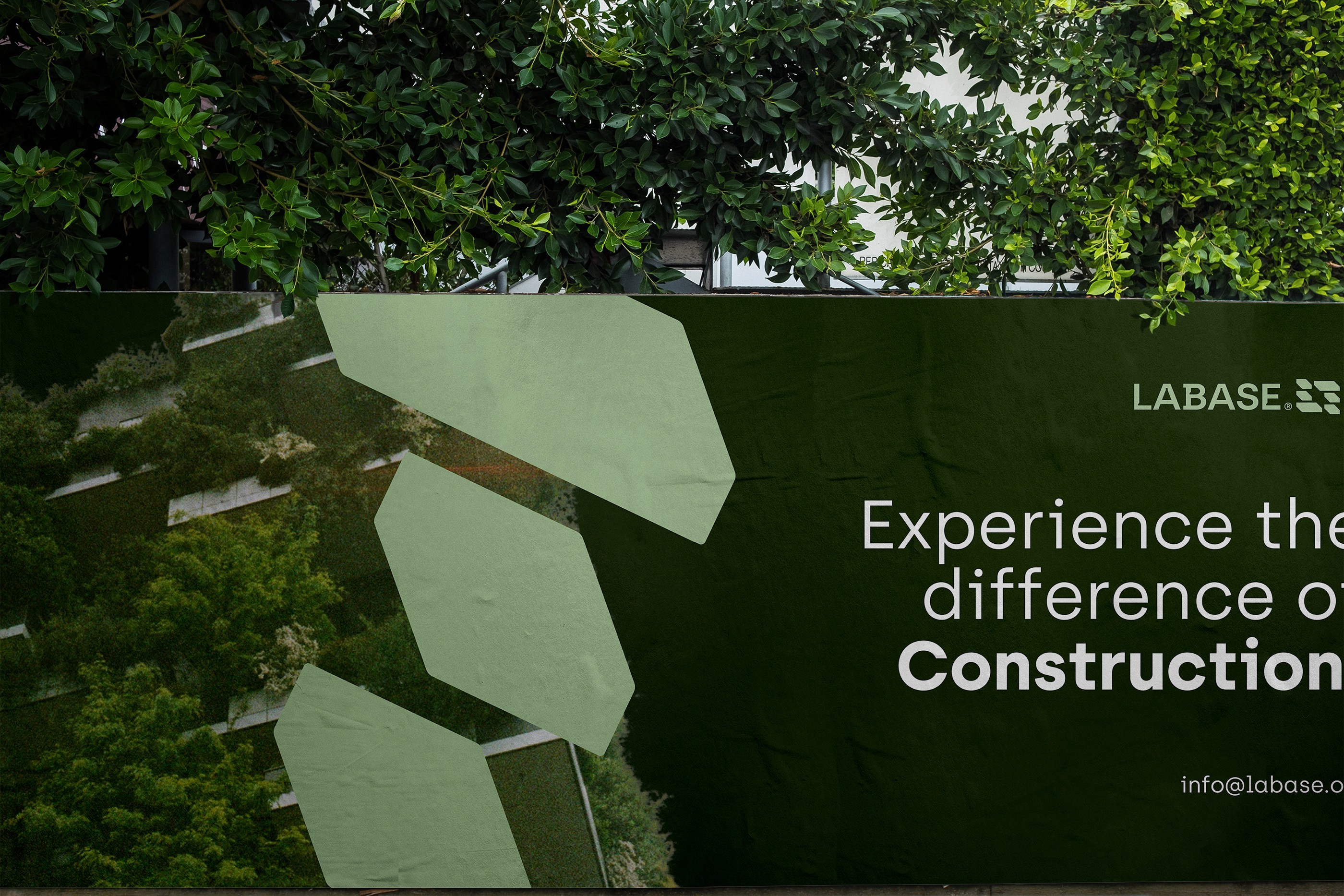
We built the visual concept on the idea of “Structure Meets Clarity” — a system that embodies precision, order, and trustworthiness while keeping a minimal yet dynamic visual tone. Using geometric compositions, a disciplined grid, and a bold sans-serif logotype, the identity conveys strength, reliability, and contemporary aesthetics. The color palette blends grounded greens and industrial neutrals, reinforcing the brand’s connection to both nature and urban development. Grid-based layouts and tactile textures enhance the technical and detail-oriented aspect of the business.
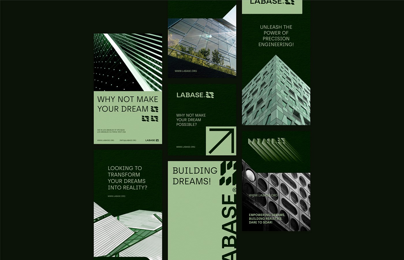
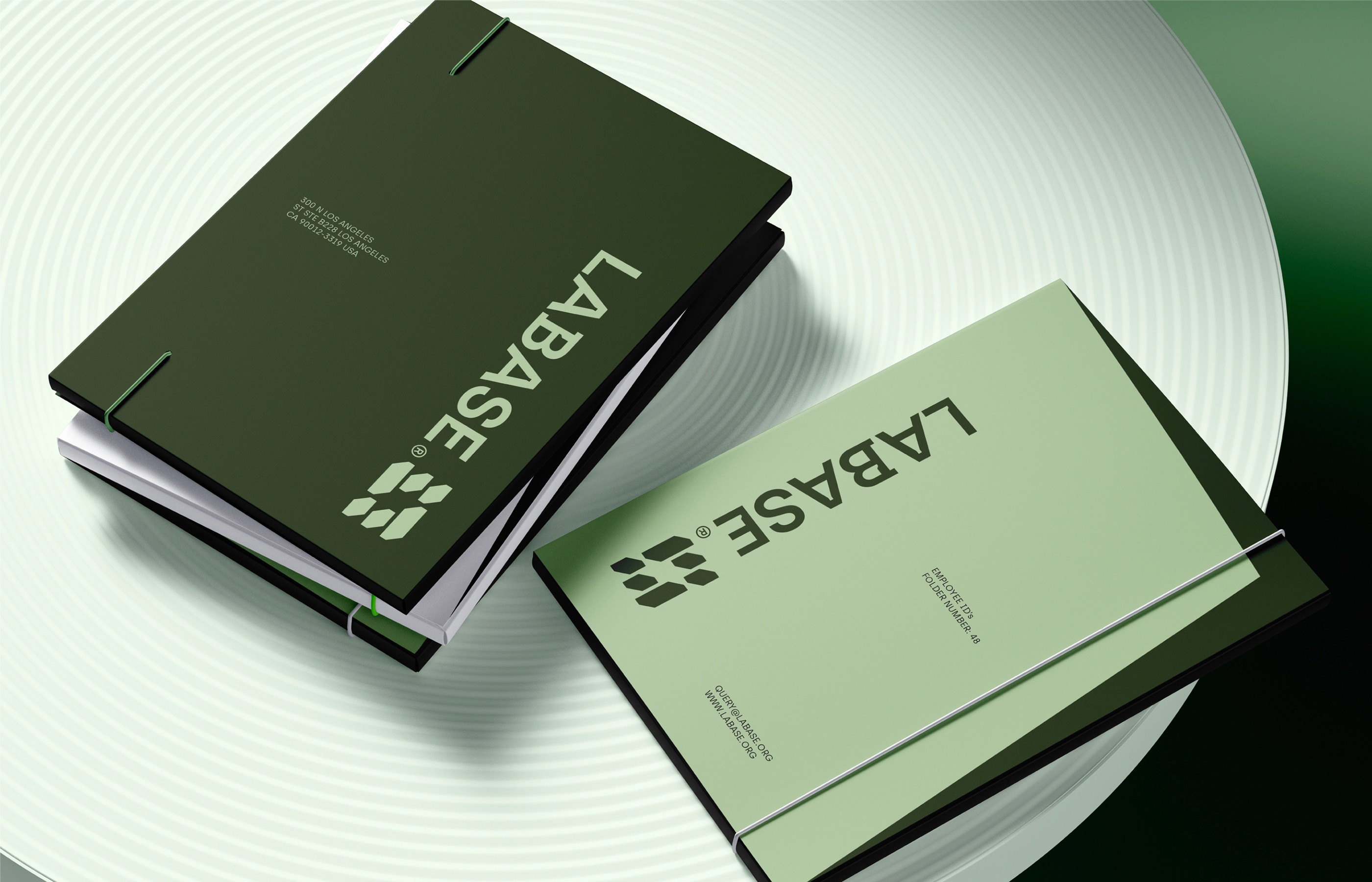
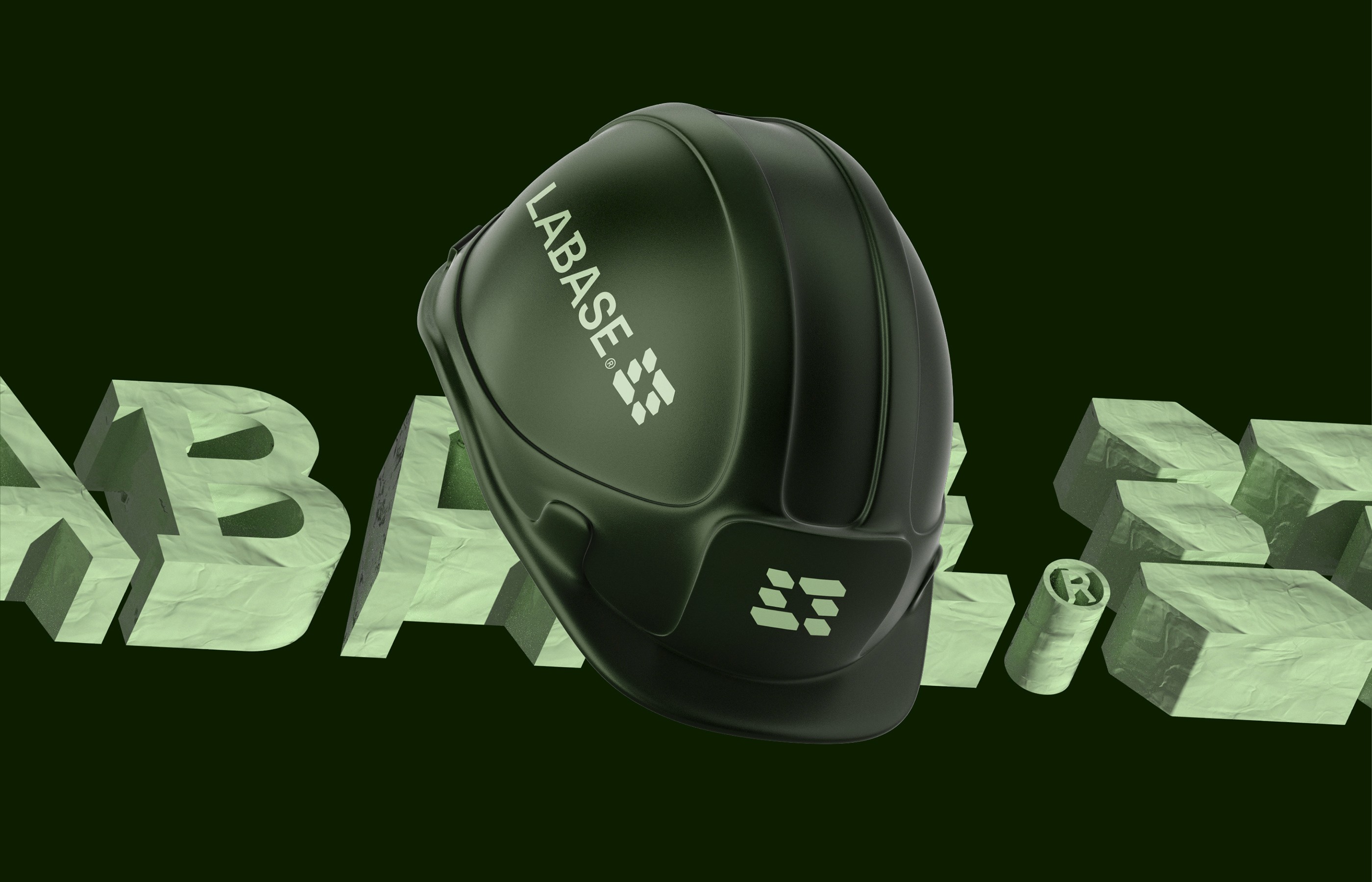
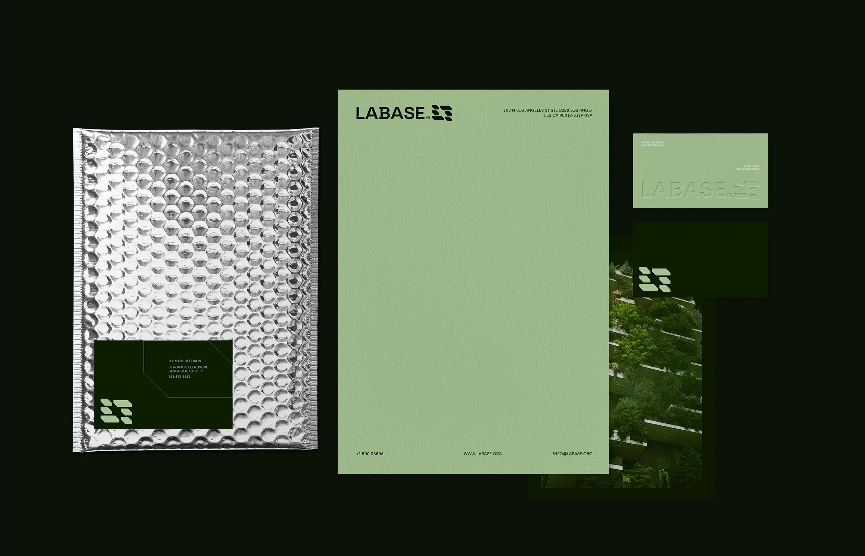
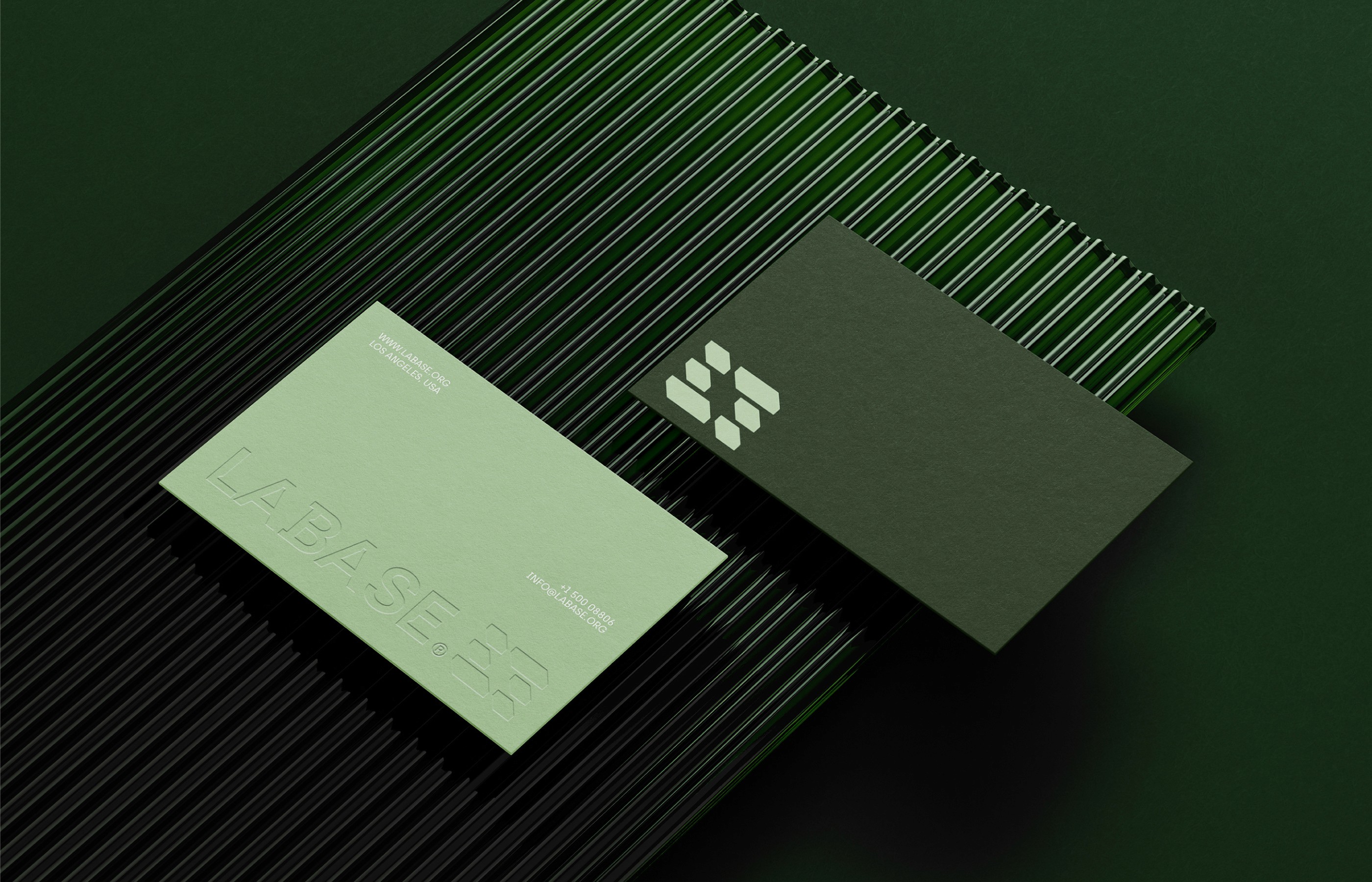
The identity system was deployed across key brand touchpoints: logo design, typography system, stationery, construction signage, uniforms, safety helmets, and vehicle branding. We also developed visual mockups for digital presence, including web interface elements and social media previews. Special attention was given to the contrast between clean information hierarchy and bold brand accents — making every touchpoint feel cohesive, modern, and unmistakably LaBase.
I was in charge of the overall creative/art direction, brand identity development, and visual system execution. I led the concept development phase, refined the logo system, and created a detailed brand application guide. I also coordinated with 3D and motion designers for visual renders and took part in final mockup composition and presentation layout.
The new identity helped redefine how LaBase is perceived — not just as a construction company, but as a forward-thinking, detail-driven brand. Internally, it fostered pride and unity. Externally, it strengthened trust and created a more memorable, credible presence in a traditionally conservative industry.